| Assignment | Points | Percent |
|---|---|---|
| Presentation, participation, and weekly tasks | 20 | 20% |
| Chart gallery and script portfolio | 40 | 40% |
| Research project | 40 | 40% |
| Total | 100 | 100% |
Syllabus
Instructor
- Prof. Tim Marchand
- minami-2, Room 411
- tim.marchand@gakushuin.ac.jp
Course details
- Thursday
- April 16 – July 17, 2026
- Period 3: 13:15 ~ 15:00
- kita-1, Room 405
Contacting me
Course objectives
This course offers an in-depth exploration of data visualisation and analysis techniques for the social sciences. It covers a range of topics including data types, sources, and the practical application of various visualisation tools such as charts, graphs, and maps.
As well as equipping the students with the skills to produce publication-ready plots, emphasis is placed on interpreting social science data accurately and ethically. The course methodology includes practical exercises, project work, and group discussions to reinforce learning. It builds upon foundational knowledge in social sciences, enhancing students’ ability to present and analyse data effectively.
Course introduction
Data rarely speaks for itself. On their own, the facts contained in raw data are difficult to understand, and in the absence of beauty and order, it is impossible to understand the truth that the data shows.
In this class, you’ll learn how to use industry-standard graphic and data design techniques to create beautiful, understandable visualizations and uncover truth in data.
By the end of this course, you will become (1) literate in data and graphic design principles, and (2) an ethical data communicator, by producing beautiful, powerful, and clear visualizations of your own data. Specifically, you should:
- Understand the principles of data and graphic design
- Evaluate the credibility, ethics, and aesthetics of data visualizations
- Create well-designed data visualizations with appropriate tools
- Share data and graphics in open forums
- Feel comfortable with R
- Be curious and confident in consuming and producing data visualizations
This class will expose you to R—one of the most popular, sought-after, and in-demand statistical programming languages. Armed with the foundation of R skills you’ll learn in this class, you’ll know enough to be able to find how to visualize and analyze any sort of data-based question in the future.
Mandatory Registration Requirement
Attendance at the first course meeting is mandatory. Prior to that, students must email an academic self-introduction with the subject line, “Data Visualisation and Analysis” to the instructor at tim.marchand@gakushuin.ac.jp before the first class meeting.
This should include a brief outline of your undergraduate studies, goals you wish to achieve during this graduate program, area(s) of interest in the social sciences, and specific reasons for enrolling in this course.
You will be required to bring your computer (PC or Mac) to every class meeting.
Important pep talk!
I promise you can succeed in this class.
Learning R can be difficult at first—it’s like learning a new language, just like Spanish, French, or Chinese. Hadley Wickham—the chief data scientist at RStudio and the author of some amazing R packages you’ll be using like {ggplot2}—made this wise observation:
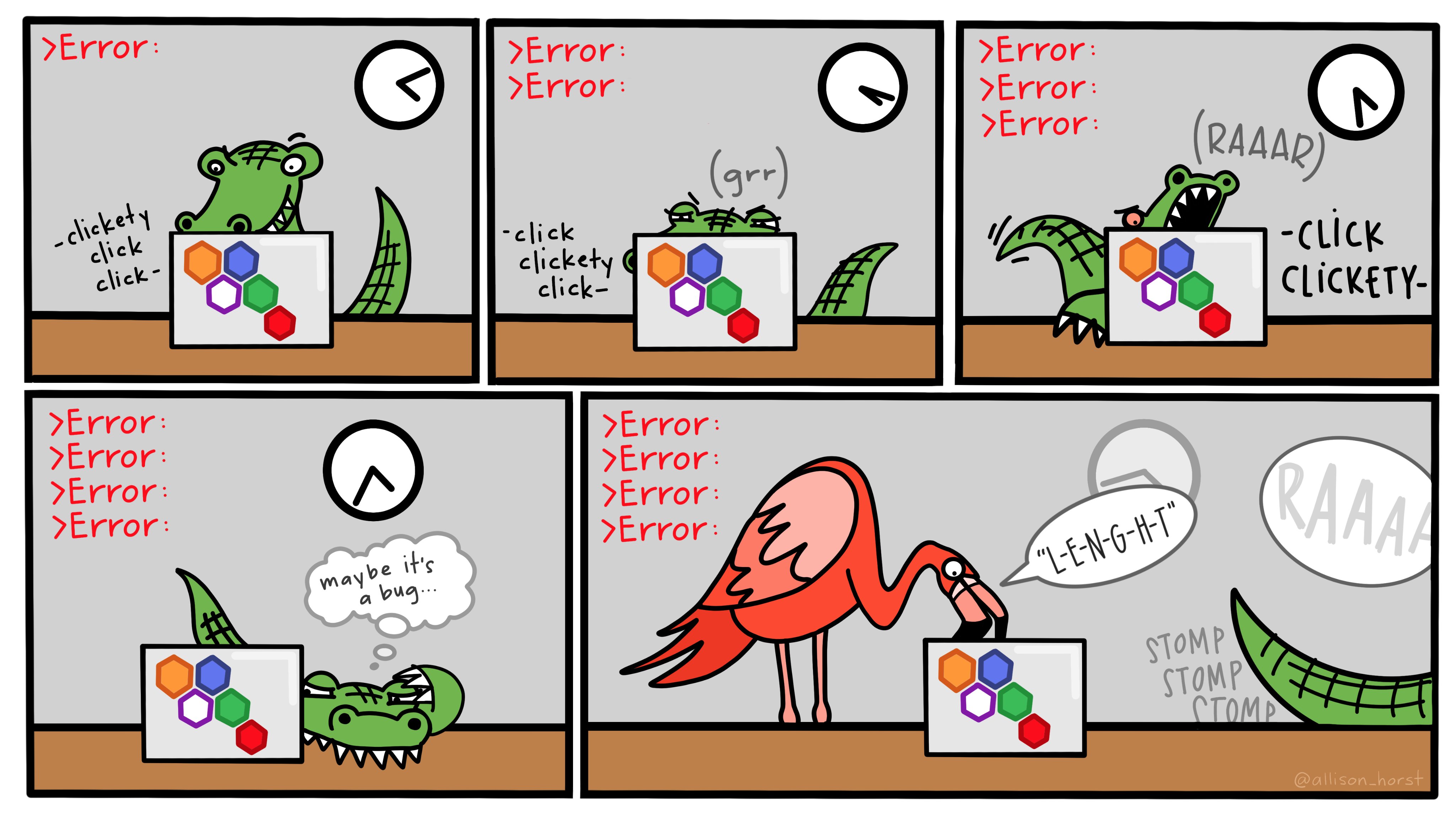
It’s easy when you start out programming to get really frustrated and think, “Oh it’s me, I’m really stupid,” or, “I’m not made out to program.” But, that is absolutely not the case. Everyone gets frustrated. I still get frustrated occasionally when writing R code. It’s just a natural part of programming. So, it happens to everyone and gets less and less over time. Don’t blame yourself. Just take a break, do something fun, and then come back and try again later.
Even experienced programmers find themselves bashing their heads against seemingly intractable errors. If you’re finding yourself taking way too long hitting your head against a wall and not understanding, take a break, talk to classmates, e-mail me, etc.
Course materials
All of the readings and software in this class are free. There are free online versions of all the textbooks, R and RStudio are inherently free, and you can use free vector editing software.
Books, articles, and other materials
We’ll rely heavily on these books, which are all available online (for free!). I recommend getting the printed versions of these books if you are interested, but it is not required.
Alberto Cairo, The Truthful Art: Data, Charts, and Maps for Communication (Berkeley, California: New Riders, 2016). $20 used, $50 new at Amazon.
A free eBook version is available through GSU’s library through O’Reilly’s Higher Education database. The easiest way to access it is to visit a special URL (http://go.oreilly.com/georgia-state-university), log in with your GSU account, and then search for “The Truthful Art”.
Kieran Healy, Data Visualization: A Practical Introduction (Princeton: Princeton University Press, 2018), http://socviz.co/. FREE online; $20 used, $40 new at Amazon.
Claus E. Wilke, Fundamentals of Data Visualization (Sebastopol, California: O’Reilly Media, 2018), https://serialmentor.com/dataviz/. FREE online; $36 used, $50 new at Amazon. An eBook version is also available through the O’Reilly database, but you can just use the online version.
There will occasionally be additional articles and videos to read and watch. When this happens, links to these other resources will be included on the content page for that session.
R and RStudio
You will do all of your analysis with the open source (and free!) programming language R. You will use RStudio as the main program to access R. Think of R as an engine and RStudio as a car dashboard—R handles all the calculations produces the actual statistics and graphical output, while RStudio provides a nice interface for running R code.
R is free, but it can sometimes be a pain to install and configure. To make life easier, you can (and should!) use the free Posit.cloud service, which lets you run a full instance of RStudio in your web browser. This means you won’t have to install anything on your computer to get started with R!
Posit.cloud is convenient, but it can be slow and it is not designed to be able to handle larger datasets or more complicated analysis and graphics. You also can’t use your own custom fonts with Posit.cloud. Over the course of the semester, you’ll probably want to get around to installing R, RStudio, and other R packages on your computer and wean yourself off of Posit.cloud. This isn’t 100% necessary, but it’s helpful.
You can find instructions for installing R, RStudio, and all the tidyverse packages here.
Online help
Data science and statistical programming can be difficult. Computers are stupid and little errors in your code can cause hours of headache (even if you’ve been doing this stuff for years!).
Fortunately there are tons of online resources to help you with this.
Online communities
If you use Bluesky or Mastodon or Threads or LinkedIn, post R-related questions and content with #rstats. The R community is exceptionally generous and helpful.
Searching for help with R on Google can sometimes be tricky because the program name is, um, a single letter. Google is generally smart enough to figure out what you mean when you search for “r scatterplot”, but if it does struggle, try searching for “rstats” instead (e.g. “rstats scatterplot”). Also, since most of your R work will deal with {ggplot2}, it’s often easier to just search for that instead of the letter “r” (e.g. “ggplot scatterplot”).
You can also check out the Posit Community, a forum specifically designed for people using RStudio and the tidyverse (i.e. you).
AI, LLMs, BS, and vibe coding
I highly recommend not using ChatGPT or similar large language models (LLMs) in this class.
I am deeply opposed to LLMs for writing.
I am a little more lenient using LLMs in coding, but I am deeply opposed to them for beginners at code.
By definition, LLMs and other AI tools cannot produce truth (or even lies). They generate bullshit1—a formal philosophical term that refers to text or speech that has no regard for truth (Hicks, Humphries, and Slater 2024; Frankfurt 2005).
1 As a faculty member at Gakushuin University, it is not my habit to swear or curse, but in this case, the word has a formal philosophical meaning (Frankfurt 2005), so it doesn’t count :)
Please read this to better understand how LLMs circumvent the writing and learning process.
Do not replace the important work of writing with AI BS slop. The point of writing is to help crystalize your thinking. Chugging out words that make it look like you read and understood the content will not help you learn. Chugging out code that you hope works is vibe coding and it will not help you learn.
A key theme of the class is the search for truth. Generating useless content will not help with that.
The main exception to my opposition to LLMs is using Gen AI to help understand any error messages that R might produce when you code. In that case, I’d recommend Claude over the others (a lot of its background coding is done in R, unlike other chatbots which tend to use Python).
In your session check-ins and assignments, I want to see good engagement with the readings. I want to see your thinking process. I want to see you make connections between the readings. I want to see your personal insights. I don’t want to see a bunch of words that look like a human wrote them. That’s not useful for future-you. That’s not useful for me. That’s a waste of time.
I will not spend time trying to guess if your assignments are AI-generated.2 If you do turn in AI-produced content, I won’t automatically give you a zero, with one exception: if your work contains fake data, it will receive a zero. I’ll grade your work based on its own merits. I’ve found that AI-produced content will typically earn a ✓− (50%) or lower on my check-based grading system without me even needing to look for clues that it might have come from an LLM. Remember that text generated by these platforms is philosophical bullshit. Since it has nothing to do with truth, it will not—by definition—earn good grades.
2 There are tools that purport to be able to identify the percentage of a given text that is AI, but they do not work and result in all sorts of false positives.
Course schedule
We meet in person every Thursday during the 3rd period on the Mejiro Campus.
This is a hands-on, synchronous course. Our time together will consist of lectures and discussions about the principles of data visualisation, followed directly by coding practice in class. Because of this, you are required to bring your computer (PC or Mac) to every class meeting.
Each week revolves around a central theme and includes (1) a set of foundational readings, (2) an interactive coding lesson, and (3) reference examples with reproducible code. The schedule page provides an overview of all these moving parts.
To succeed in this course, I recommend following this general process for each session:
- Before class: Complete the assigned readings on the content page () to understand the core design and ethical principles for that week.
- During class: Participate in the discussion and work through the coding lesson () and examples ().
- After class: Spend an absolute minimum of 1.5 hours on coding practice and reflection. You will use this time to build your chart gallery and script portfolio, and work on your research project. Expect to spend more time outside of class as we approach the end of the semester.
Assignments and grades
You can find descriptions for all the assignments on the assignments page.
| Grade | Range | Grade | Range |
|---|---|---|---|
| S | 90–100% | C | 60–69% |
| A | 80–89% | F | < 60% |
| B | 70–79% |
Acknowledgments: This course is a derivative of PMAP 8551 designed by Andrew Heiss at Georgia State University. I have adapted the materials for the ISS context at Gakushuin University.
References
Frankfurt, Harry G. 2005. On Bullshit. Princeton: Princeton University Press.
Hicks, Michael Townsen, James Humphries, and Joe Slater. 2024. “ChatGPT Is Bullshit.” Ethics and Information Technology 26 (2): 38. https://doi.org/10.1007/s10676-024-09775-5.